PMF goes behind the scenes to see the branding work being done at Continental Direct.
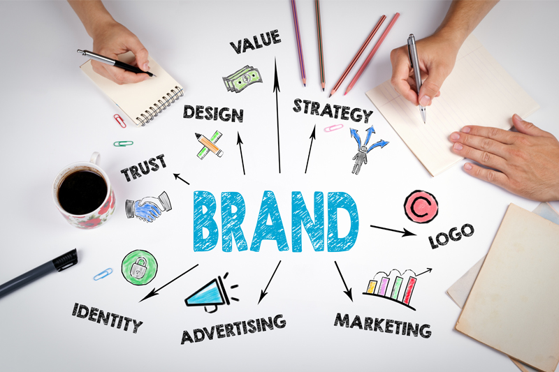
Your brand is who you are and what you do, the values you stand for and the promises you make. Branding is your opportunity to clearly communicate that message to the outside world. Get it right and you create brand recognition, establish your reputation and create customer loyalty!
Branding is all the different ways you talk to your prospective customers about you. Every interaction you have with your customers should make a good impression, in person, through your products and the service you give. On this foundation you can build a clear, distinctive and memorable identity, one that allows your business to be noticed, stand out from the competition and be remembered.
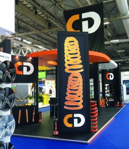
Creating a business identity begins with the company logo and can further include brand colours, selected typefaces, trademarks, slogans, and mascots. Setting guidelines for the brand helps to ensure you are consistent at all times across all media; an identifiable brand voice speaking clearly at every given chance. These include stationary, print, websites, livery, advertising campaigns through to exhibitions, sponsorship and packaging.
Clear logo
“The Continental Direct brand was clear from the beginning,” says Terence East, the designer responsible for CD branding. “This is a company born from years of experience in the UK aftermarket, with the goal of providing the highest quality parts, whilst striving for a strong price advantage to the reseller. The professionalism of the team, their skill and the resulting confidence was apparent and my task was to create an identity to reflect this.”
“Strong, clean, with minimal design felt like the appropriate way of capturing the focused, uncluttered approach that CD demonstrates. The logo is an example of this. The key letters with incomplete curves evoke the dynamism of automotive vehicles and the company itself; whilst the strength of the colours chosen and their bold use in a stable, solid box shape seek to convey the assured confidence of the company’s vision.”
That logo, the colour scheme and typeface, created back in 1999, remain unchanged to this day. The company continues to work with its designer to strengthen the CD brand across the whole spectrum, including advertising, brochures, exhibition graphics and packaging.
“The CD brand has been built through a team of skilled personnel, ensuring positive customer experiences with a combination of products that perform as promised, a standard of quality that exceeds expectations, and pricing that creates strong profitability,” says Jason Noon, CD Product Manager.
“Applying and utilising design in our branding from the very beginning has certainly been a positive factor in the success of CD. With all the hard work, skill and experience at play in ensuring the products are the best they can be, it is always important to ensure the presentation of those products reflect that same level of effort and professionalism. To disregard packaging, for example, would be a missed opportunity. The packaging talks for both the product and the company.”
Packaging
“Packaging design should achieve its main purpose – to be useful,” says Terence. “The goal is to transmit quickly the key information: the product and the brand. Secondly, its appearance should reflect favourably on the product inside and the company behind it.
“When designing packaging we bring all the existing elements of CD branding together. The CD brand is readily identified through the consistent use of a black background that accentuates the strength of the brand colour orange. We combine the use of a large, clear logo with a brand colour orange panel. The product is identified by large, clean text in the brand typeface and we create a line drawing also in the brand orange. These product illustrations provide a simple and clear picture of what is in the box, enabling quick identification in the working environment. A technical drawing style is used to reflect the skill and complexity of manufacturing the product inside. Designing with these elements according to the brand guidelines allows us to build the brand right into the packaging.”
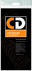
Last year, CD launched coil springs at Automechanika UK. The decision was made to sell coil springs in factory matched pairs. This harmonised with the company value of offering not only the highest quality product, but also by selling in pairs to give the highest in safety and performance. To achieve minimal storage space for the factor, the team opted for the springs to be packed together in a branded bag. By printing to only one side of a transparent bag, CD could showcase the product itself.
“The quality of the springs meant getting the packing bag right was crucial,” says Jason. ”We’re really pleased with the result, ensuring safe handling, protection of the springs and even a reduction in packaging waste.”
“It’s possible to elevate packaging beyond the functional,” says Terence. “We’re aspiring to a useful and attractive design that successfully conveys the product and brand values and adds to brand recognition.”
Successful brands grow year-on-year, and the input of a designer in the course of brand development can be a great advantage. The time and attention you invest in caring for your brand and its values can lead your customers and your employees to care about your brand too.


